BowFlex Rebrand E-Commerce Site
During Bowflex’s rebrand into the new BowFlex, they needed an entire website overhaul. The new site needed to correct long standing usability issues, incorporate updated standards and practices, and maintain adherence to the new brand vision and voice. This project consisted of a design system, 50 pages of the website, 5 unique templates, hundreds of molecules + components, and Developer + Marketing notes for every section of every page.
My role was Lead UX/UI Designer, working in tandem with a Front End Developer, the Senior Marketing Brand Designer, and the Back End Engineering Manager who delegated work to the overseas teams.
Problem Solving: PDP and Protection Plans
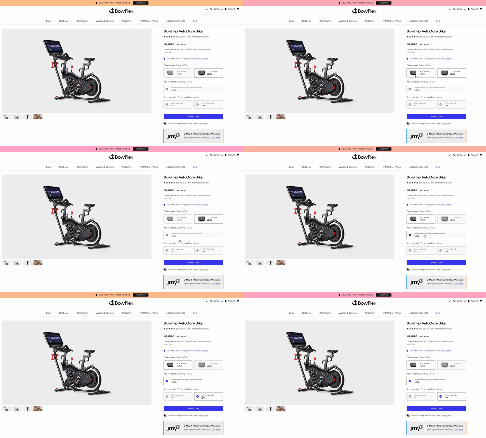
Protection Plans were the highest ROI, but lowest conversion item due to confusing advertising and poor site placement.
I started this project by learning everything there was to know about Protection Plans, how they worked, what they covered, and what benefit they had to the customer. Using my UX writing skills I reworked the offering into a simple and concise bulleted description, meeting with sales, legal, and customer care to make sure we were completely aligned on the language and placement. This feature went over extremely well and lead to increased conversion overall.
Positioning the Protection Plan as an “upgrade” and placing it directly above the Add to Cart button ensured that the user would not miss the information or misunderstand the offering.
Garage Gym Reviews
The Garage Gym Reviews website is part of the fitness vertical in the Pillar4 Media group. My expertise in UX, and specifically in the fitness e-commerce space, made me ideally suited to aid in the continuing optimization of this site.
When I started with the Garage Gym Reviews brand, one of my first tasks was to create its first design system. Using Figma I consolidated all of the colors, fonts, grids, spacing, atoms and molecules into one file we referred to as the UI Kit. I then iterated on a much more accessible version that was able to be used and navigated company-wide without the user having any Figma experience. Below is an outdated version of that document for public viewing
GGR: Foundational Product Block
As lead designer of the fitness vertical, I was asked to create a universal Product Block, meeting the specific needs of each owned and operated site we ran, but capable of consolidation to a single dev build.
For this project I worked with Chance Chipman, Senior UX Designer and leader of the Sleep vertical, to gather internal + market research and begin our product build. My experience at Bowflex meant I was extremely well versed in the online customer journey as it relates specifically to fitness products.
Initial Wireframe
After gathering and sorting market research, internal company research from SEO and UXR teams, and sketches from relevant project stakeholders, we began creating early wireframes.
HiFi Designs
Once wireframes went through approval rounds and were stress tested with real-world information and images, we began the process of creating high fidelity designs that were fully skinned to each brand’s style guide specifications. We then created content source docs to help all parties involved in the implementation process.
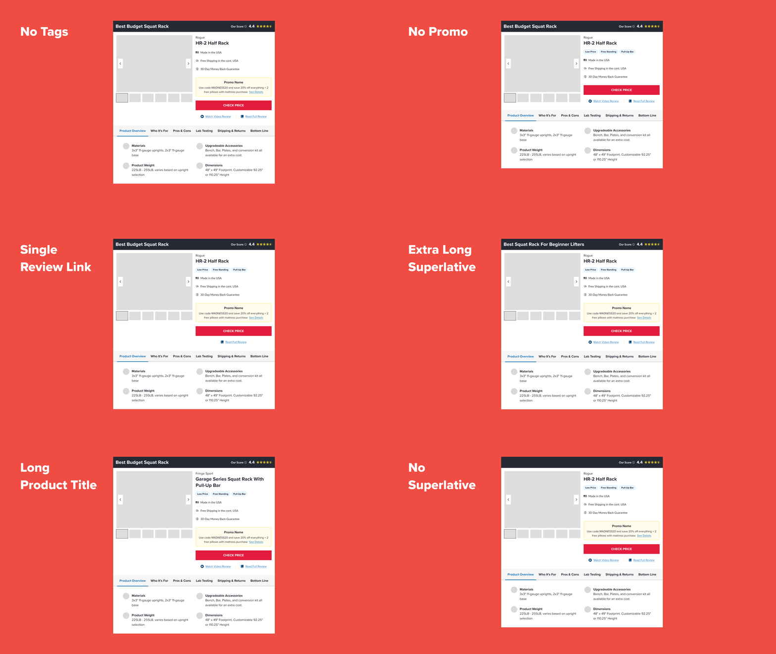
Edge Cases
No product build is complete without edge cases! Once skinned and finalized, I fool-proofed the design and provide breaking points for the development team. This practice is always the most interesting part of a product build because you get to intentionally try to break what you have spent weeks creating.


